
Donna Works
Prove what you pitch
As a UX/UI designer and front-end developer, I couldn't just show up with a portfolio that only told people what I could do. It had to actually show it.
That's why I redesigned and rebuilt my portfolio: a website where design, development, illustration, motion and copy don't just sit next to each other, but visibly work together.
My work evolved. My portfolio didn't.
My old website was not bad. I had designed and built it myself, with custom illustrations, motion and a clear visual direction.
But the content didn't do much.
It was still hard to tell who I was as a designer and developer. My skills were listed as separate labels on the page. The case studies mostly showed the final result, sometimes with not much more than a video and a few lines of text.
Honestly, I also knew I could make something better now.
Now that AI makes it easier to create something decent pretty quickly, a lot of things are starting to feel the same. I wanted something that could not have come out of a few prompts.
Not a standard template with my name on it, but a website that could only be mine.
The new website had to show how I think and work, not just what I make.
How do you build a portfolio that does not just say what I can do, but proves it and still feels like mine?
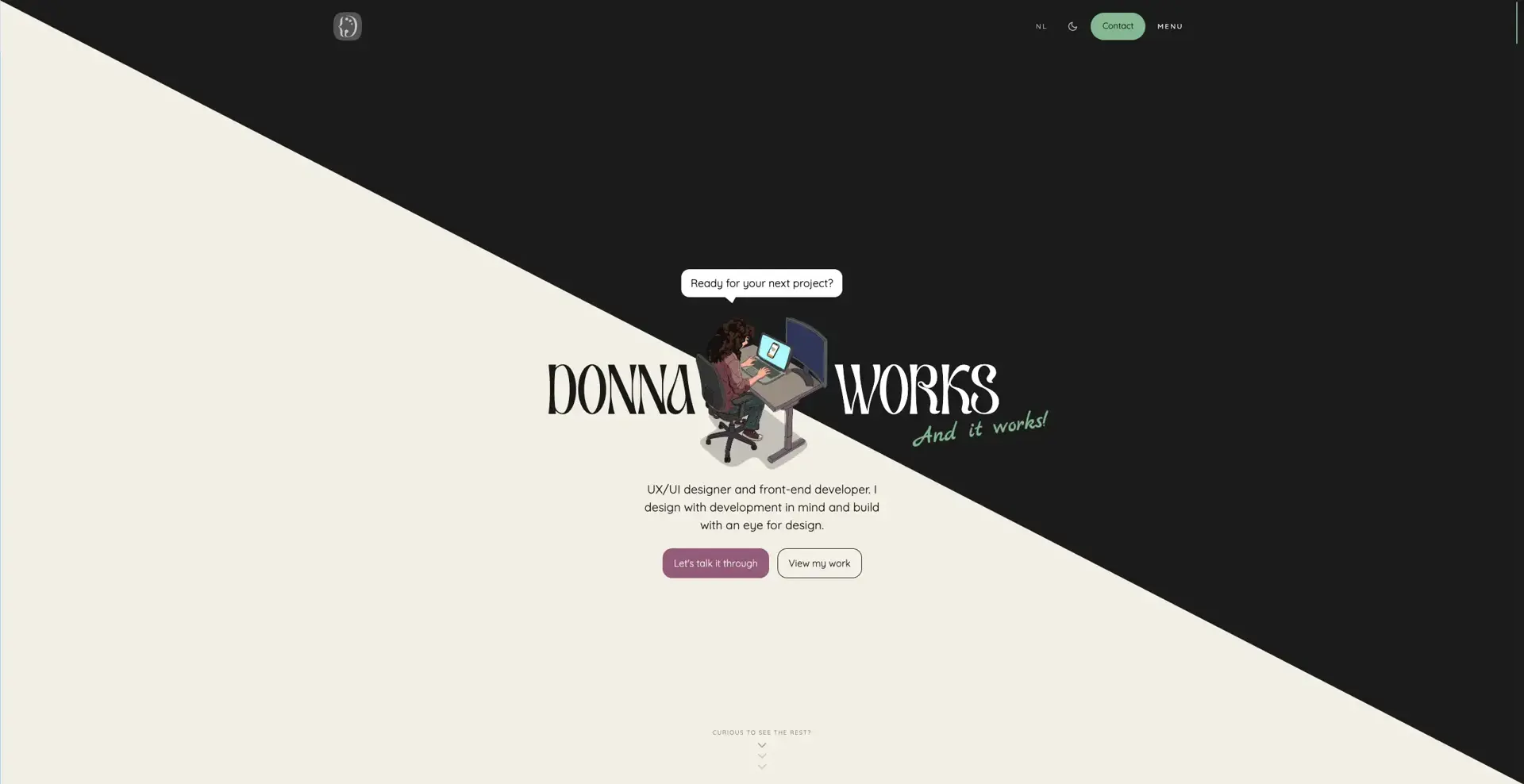
Giving the website a face
I had made an illustration of myself for my LinkedIn banner. Around that same time, I had been looking for a new direction for my website.
I tried a few visual directions. They kinda worked, but they could just as easily have belonged to someone else.
The illustration gave the style its own face. Literally and figuratively.
So instead of adding it to the design later, I used it as the starting point. A drawn version of me now appears throughout the website, each time in a different pose or situation.
That gives the site something recognizable, but mostly something that wouldn't just fit on any other portfolio. A custom illustration of me probably wouldn't do so well over there anyway.
In the hero, for example, I am sitting behind my laptop with my leg bouncing. On the screen, I zoom in with my fingers, exactly like I constantly do in real life.
Those small details make the character more than decoration. They also say something about the person behind the desk.
Some of them probably only stand out if you know me.
Which makes them more fun.
Three Ds in one shape
Where the illustration gave the website a face, the logo had to sum up the combination behind it.
The left side is based on a code bracket. The right side is based on a painter’s palette. Together, they form a D.
The D of Donna, design and development.
In one shape, the logo shows what Donna Works is about. Not design on one side and development on the other, but what happens when those two come together. Or three, technically.
At a smaller size, the D is what remains. Look a little longer and you can see what it is built from.
The homepage had to answer fast
With the first visual direction and logo in place, the foundation was there. But visitors still needed to understand quickly what I do and what I could mean for a project.
So the homepage follows a deliberate order.
The hero makes it clear right away that I combine UX/UI design and front-end development. After that, familiar clients help build trust with social proof and authority. They show that other organizations have already worked with me, while the recognizable names add extra credibility.
The services show how we can work together, while the USPs make the value of one person understanding both design and development more clear.
After that comes the proof: selected projects, my process and experiences from people I have worked with.
That order follows the questions a potential client is likely to have.
What do you do? Do you have experience? What can I hire you for? What makes your approach different or good? And where is the proof?
Not every visitor reads everything. That is why the headings carry the story for people who move through the page quickly. Those who keep reading get more context, more personality and the occasional semi-bad joke.
The footer is all about starting the conversation, and the link to the 'about page' is there if you want to get to know the person behind the desk first.
Code as design. Or design as code?
Once the content flow was in place, the next question was how the website should feel.
A lot of ideas were not just about how something looked. They were about timing, motion, scroll behavior and how something responds to a cursor.
So a large part of the visual direction moved into code pretty quickly.
An interaction can make perfect sense in a design file and still feel too slow, too busy or just annoying in the browser. By building those parts directly, I could feel them and adjust them right away.
Code basically became my sketchbook.
It's in the details
Because I worked directly in code, small interactions naturally became part of the design.
And I may have a slight weakness for that.
I am not easily satisfied with “good enough.” Once I see how a detail could be better, smarter or more fun, it is hard to pretend I did not notice.
You can see that in parts no one explicitly asked for, but that give the website more feedback, cohesion or personality.
The pin leaves a hole
The projects on the homepage hang on an interactive pinboard.
When you pick up and drag a Polaroid on desktop, the tiny pin hole stays visible.
The pinboard follows the same logic as a real one. When something is removed, it leaves a mark. That kind of direct feedback makes a digital interaction easier to understand.
No one would have complained if that hole did not exist.
I probably would have.
The favicon tracks your scroll
In the browser tab, there is a tiny laptop. As you scroll down the page, the laptop screen slowly fills up.
Long case pages ask for a decent amount of attention. A visible progress indicator gives people a sense of how much they have already read and how much is still left.
Usually, that happens somewhere inside the page.
Here, even the favicon is in on it.
The scrollbar shows exactly where you are
Next to the vertical scrollbar, the current scroll position is shown as a Y value in percentages. If you are forty percent down the page, it says Y: 040%.
The scrollbar also reacts to scroll speed. Scroll quickly and it briefly stretches with the movement.
So you do not just see roughly how far down the page you are. You also feel how you are moving through it.
It also fits right into the visual style of the website.
Even the 404 page got its own interaction
If something goes wrong anyway, it might as well be a little fun.
On desktop, the page reacts to your cursor. On mobile, it plays its own animation, so there is still something to experience without hover.
The page may not have made it to launch.
The experience did.
And these are only a few of the details hidden throughout the website.
Lots of motion. Not at the cost of accessibility.
All those interactions and animations made the website feel more personal, but they also introduced a risk. For some people, motion is unpleasant or even inaccessible.
So when reduced motion is enabled, the website does not just remove a few animations. Some parts get a different setup entirely.
The interactive pinboard, for example, becomes a regular project grid. Large scroll animations get a static alternative and moving elements can be paused. The content and functionality stay available.
That was an important rule. Motion can and does ideally add something, but it should never be required to understand or use the website.
A static version could not be a stripped-down emergency option. The same projects and functions remain available, just without the movement around them.
Accessibility does not stop at motion. WCAG 2.2 AA was also the starting point for the rest of the website.
The site is built with semantic HTML, works with keyboard navigation and includes visible focus styles, accessible labels and enough contrast.
Consistency matters too. When buttons, links and interactions behave predictably, people do not have to figure out how the website works all over again on every page. That lowers cognitive load and helps more people than only those with a disability.
That way, no one has to miss information or functionality because of motion, the lack of a mouse or the way they navigate the website.
The copy needed a redesign too
The website kept gaining character. The copy did not.
The first drafts were not exactly wrong. They mostly said which disciplines I had.
UX/UI design. Development. Illustration. Motion. AI.
Correct.
And probably forgotten five minutes later.
A list of disciplines still does not explain what someone actually gets from them. The visitor has to make the translation from “front-end development” to a fast, well-functioning website or from “UX design” to a structure where users do not get lost.
So I rewrote the website around the questions a visitor would actually have. What can I do for a project? Why is it useful when design and development sit with one person? And what does that lead to in practice?
That fixed the content. But the copy still needed a voice. The same principle applied to the copy as to the rest of the site.
If the website was not supposed to feel like a standard template, the copy could not sound like it came out of the same bucket as:
"Design, to me, is not a destination, but a launchpad for meaningful brand experiences where creativity is the fuel, technology is the engine and strategy sets the course toward impact, trust and sustainable growth 🚀✨💡."
The tone of voice had to stay close to how I actually talk, just slightly less chaotic and with. a. little. more. punctuation.
The website had to be strong in content, but also a little fun to read. So the copy got room for personality, short observations and the occasional joke that is just dry enough.
The Dutch and English versions were also written separately. They say the same thing content wise, but they are not stiff word-for-word translations. A sentence that feels natural in Dutch does not automatically work in English too.
That is how lines like this came about:
I design with the build in mind and build with an eye for design.
And an error page that simply says:
This page did not make it to launch.
The copy therefore did not become something that was dropped into empty boxes after the design was done.
The words shape the hierarchy, rhythm and personality of the website just as much.
Under the hood
All those choices eventually had to work technically too.
What you are reading now runs on Next.js, React and TypeScript.
For the Dutch and English versions, I use next-intl. The interactions and animations are built with GSAP, Lenis and Lottie.
Dark mode, light mode and motion preferences are remembered, so the website does not forget what someone prefers on the next visit.
Technology
Next.js · React · TypeScript · GSAP · Lenis · Lottie · next-intl · CSS Modules · Netlify
The website had to make the case.
Altogether, the website had to do exactly what my previous portfolio did not do enough.
The result is a bilingual website where every part shows a different side of my work.
The structure shows how I organize information. The order of the homepage helps visitors move from introduction to proof.
The visual style, logo and illustrations show my design work. The interactions and technical build prove that I can build it too. The copy makes sure people still understand what they are looking at along the way.
The website includes:
- a custom identity and logo
- original illustrations and motion
- Dutch and English content
- dark mode and light mode
- reduced motion and accessible alternatives
- interactive projects and detailed cases
- a flexible system that can grow with new work
The most important change is easier to summarize.
A website that showed my projects.
A website that shows how I design and build.
That ended up being the real assignment.
Live. For now
And then there is the final problem with your own portfolio: you can keep tweaking it forever.
There can always be one more project to add, one transition to tweak or one line that is not quite done annoying me yet. I redesigned parts of it and probably spent more time on certain details than strictly necessary.
At some point, a website just has to be published.
The website is now live, represents my work as it is today and is flexible enough to change again later.
There are, of course, still ideas on the list. Probably not a huge surprise if you have read the case this far.