
Planning App
A planner for days that don't always go according to plan
Making a plan isn't the hard part. Making one I actually keep using turned out to be a different story.
It needed to be more than a place for tasks and appointments. The app had to create overview, help me get started and keep me motivated, even on days when I planned too much or the whole thing fell apart halfway through.
Existing tools got close, but they always missed the exact mix of rest, flexibility and progress that worked for me.
So I built it myself.
My first planning system lived in Notes. That worked fine until the list got longer and the overview disappeared anyway.
Then came Notion, with Make, Google Calendar and a local AI model for generating daily schedules. It worked, but more and more time went into maintaining the system itself.
Existing apps were okayish. One was good for habits, another for projects or appointments. Something was always missing.
So the problem wasn't just where my planning lived.
I needed a system that didn't just tell me what had to happen, but helped me start, stay oriented and keep going after a bad day.
How do you build a planner that gives structure and motivation, leaves room for imperfection and makes those imperfections visible too?
A list that gets shorter while you work
The first question wasn't: where do I put all my tasks?
The question was: how do you keep a planning overview clear while it is being used?
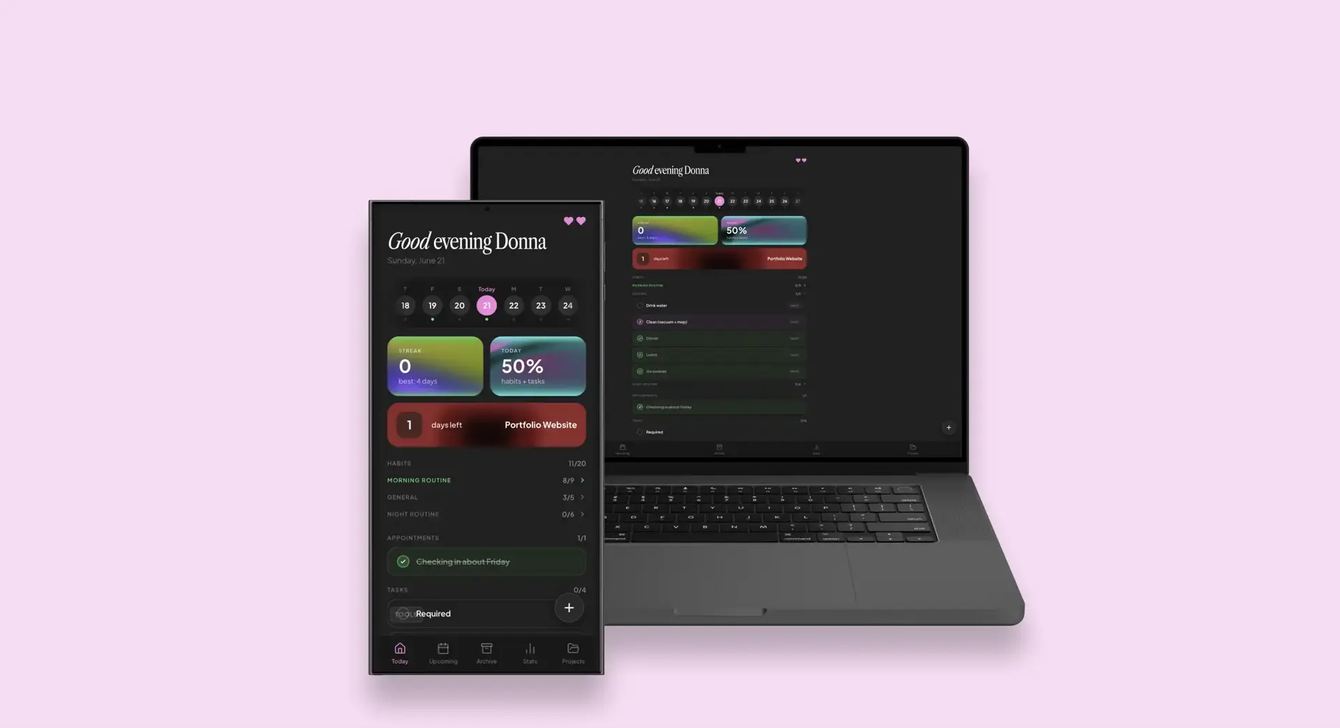
That is why the homepage starts with today.
It shows habits, appointments and tasks. Not everything that still needs to happen this month, but what is relevant right now.
Those parts stay intentionally separate. An appointment usually belongs to a specific time and place. A habit is about repetition and a task asks for one concrete action. They belong to the same day, but they don't work the same way.
Tasks can also be grouped by project. Once every task in a group is completed, that group collapses. The list gets shorter while you work.
That lowers cognitive load. A long list keeps asking for attention from everything that is still open. By breaking information into smaller groups, there is less to process at once.
At the same time, the progress percentage goes up. The app doesn't only show what is left to do, but also gives direct feedback on what has already been completed.
The closer a goal feels, the more motivated people often become to finish it. That is called the goal gradient effect. A shrinking list, rising percentage and fuller progress bar make that progress visible.
Progress you don't want to lose
Habits appear in a yearly grid, similar to GitHub's contribution graph.
Every completed day adds a green square. Over time, a visible pattern starts to form. The next day no longer feels like one loose checkmark, but like another piece of something that has already been built.
The same principle sits behind the streak at the top of the dashboard.
People are often more motivated to avoid losing existing progress than to start again from zero. That connects to loss aversion: losing something that already feels ours weighs more heavily than a similar gain.
Apps like Duolingo use that principle for a reason. On day one, a streak doesn't mean much. On day 471, stopping suddenly becomes a lot harder. That is my streak as I am writing this.
Yes, they got me.
But that shouldn't mean one difficult day wipes all the progress.
Motivation without unfair punishment
I once had a movement streak of more than a month in Samsung Health. Then one day something happened and moving was genuinely not possible.
If I could have done it, I would've. I genuinely couldn't.
Still, the full streak disappeared. It didn't feel like I had broken it myself. It felt like the app had taken it away from me.
Technically, the app correctly registered that I had not reached my goal. Psychologically, it worked against itself. The motivation to protect the streak was gone because the outcome didn't feel fair.
That is why my planner separates skipping from being unable to do it.
With rest mode, a specific item can be paused for that day. It doesn't turn green because it wasn't completed. In the overview, it gets a pink status instead of a green one. That way the app doesn't reward you, but it also doesn't ruin the streak for no good reason.
The app also uses a heart system. By keeping a streak going, you can earn lives that absorb a missed day.
For periods where the normal routine intentionally doesn't apply, there is vacation mode. The streak stays intact and a linked packing list automatically appears three days before departure.
The goal isn't to make every square green at all costs.
The goal is to make sure one different day doesn't take away all motivation for the next one.
Not everything has to happen today
A normal task list doesn't make much of a distinction between something that truly has to happen and something that would be nice to do.
That means a hobby, a small idea or something that might be useful can quickly start to feel as urgent as a deadline.
Tasks in the app can therefore be required or optional.
An optional task has no consequences if it isn't completed. If it does get done, it earns bonus points that can help unlock a new heart.
That keeps the task visible and rewards extra effort, without turning every activity into an obligation.
For me, that keeps something fun from slowly turning into homework.
Big projects start with one concrete step
A project like "finish portfolio" sounds clear, but it isn't really an executable task.
There are still all kinds of decisions hidden inside it. Which page comes first? Which visuals are still missing? Which copy needs rewriting? And when is it actually done?
That kind of vagueness makes big tasks overwhelming. Before someone can start, they first have to decide where to start.
Inside the app, a project is therefore broken down into smaller, concrete tasks. Not "finish portfolio", but for example "select visuals for the Charlie case" or "test mobile navigation".
That lowers the barrier to starting. The next action is already clear, which means there are fewer decisions to make in that moment.
The app uses a form of progressive disclosure. At project level, you see the larger goal and total progress. Inside the project are the individual steps. On the daily overview, only the task that is relevant now appears.
The full complexity remains available, but it isn't shown everywhere at once.
A big project is still big.
It just no longer feels like everything has to happen at the same time.
Tomorrow gets to show up early
Important appointments and tasks appear at the top of the dashboard one day in advance.
A small heads-up that something is coming tomorrow that may already need attention today.
Project deadlines work in a similar way. The homepage shows how many days are left. As the deadline gets closer, the color changes from green to yellow and eventually red.
After the deadline, the counter continues as a negative number.
Not exactly subtle. But definitely clear.
For a full monthly overview, I use Google Calendar. I could have built my own calendar too, of course, but Google already had one.
That is why appointments and tasks sync both ways.
That way, each interface can do what it is good at, without me having to maintain the same planning in multiple places.
Adding a task shouldn't become a task
Through the menu, a task, appointment or habit can be set up in detail.
Think date, time, location, repetition, priority, status and linked project.
It is useful that all of that is possible, but not every idea needs that much information right away.
That is why there is also a brain dump. Something can be saved quickly without choosing a date, project or category first. Organizing can happen later.
For larger planning sessions, I built an import feature. That makes it possible to add several weeks of tasks at once, without entering every item one by one.
Through the widgets, tasks can also be checked off or added without opening the full app first.
The lower the barrier to quickly capturing something, the smaller the chance that a good idea ends with an optimistic "I'll remember that in a second" moment. You won't.
Ten tasks done. Out of twenty.
Only showing the number of completed tasks gives a distorted picture.
Ten completed tasks sounds productive. When twenty were originally planned, it tells a different story.
That is why I built the plan ratio.
It compares how much was planned for a week or month with how much of it was actually completed. Twenty planned items and ten completed items result in a ratio of 50%.
The score doesn't judge how hard someone worked. It shows how realistic the planning was upfront.
That helps with the planning fallacy: the tendency to underestimate how much time and effort something will take. By repeatedly comparing expectations with outcomes, a more realistic picture of what actually fits into a day or week starts to form over time.
The archive shows per day, month and project what was completed and what was left open. That makes output visible, but also how realistically time was estimated.
The green squares create motivation.
The plan ratio keeps the planning honest.
The user kept asking for new features
Many features didn't come from a perfect product vision.
They came from using the app every day and repeatedly running into something.
The first version was smaller. Daily use kept exposing the next problem.
The planning turned out to be too optimistic, so the plan ratio was added. Not every task felt required, so optional tasks were added. A monthly overview was still missing, so Google Calendar sync was built. Adding something quickly still took too many steps, so widgets and a brain dump were added.
Almost every feature started with the same observation:
This still doesn't work the way I need it to.
That made the app fully tuned to the way I plan. That was also exactly the point. I didn't build it as a generic productivity tool or with a public release in mind.
People who saw it did say they would want to use it too. A nice compliment, but the most important user is still the person who built it.
The same planning. Four different interfaces.
A planner isn't very useful if it is only available on the device that happens to be out of reach.
The app works in the browser, as an Android app and through widgets on Android and macOS. Everywhere, the same planning is shown. When a task is checked off in the macOS widget, that status also changes in the browser and on Android. New items appear on all devices right away.
Firebase keeps the data in one place. That keeps everything in sync.
But having the same planning in four places didn't mean every interface had to become a smaller copy of the previous one.
In the browser, there is room for projects, statistics, archives, lists and settings. A widget needs to answer two questions in a few seconds: what still needs to happen today and what can be checked off right away?
For the Android widgets, I worked with Kotlin. I built the macOS widgets with Swift. Both were fairly new to me and widgets quickly turned out not to be tiny web pages. They have different limitations, refresh differently and leave very little room for interaction.
Building for multiple platforms forced the same product to be reduced back to its core again and again.
A useful exercise for an app that was getting more extensive at the same time.
Technology
Firebase · Google Calendar API · Kotlin · Swift · Android · macOS widgets · PWA
From loose lists to one system
The end result is a planning app where tasks, appointments, habits and projects come together.
- daily dashboard with tasks, appointments and habits
- projects with subtasks, deadlines and progress
- reference lists for packing lists and loose collections
- streaks, hearts and sleep mode
- required and optional tasks
- plan ratio and habit grid
- brain dump and import feature
- bulk select to edit multiple items at once
- archive, filters and statistics
- Google Calendar sync
- locations on tasks, linked to Google Maps
- web app and Android app via Capacitor, built from the same codebase
- three Android widgets via Jetpack Glance and three macOS widgets via SwiftUI and WidgetKit
- real-time sync via Cloud Firestore, daily reset via Cloud Functions
The most important result isn't that everything now lives in one app.
The app helps maintain overview, break big projects into smaller steps and make progress visible. It provides enough motivation to keep going, but also leaves room for days when that doesn't quite work out.
Exactly what I missed in the systems I used before.
Done. Except for a few tasks
The app is now part of my daily routine.
Because of that, I still run into things I want to adjust, improve or add. Ironically, the planning app still has open tasks for the planning app.
But at least I know exactly where they are.
And maybe one more task will be added someday: release the app.